Overview
The Buttons row block for the Product Details Page (PDP) in the Surge theme allows you to add up to 6 custom buttons to your product pages. With built-in metafields connectivity, you can dynamically connect button labels, links, and destinations to product-specific data for ultimate flexibility across different items in your catalog.
Step-by-Step Guide
Step 1: Add the Buttons Row Block to Your Product Section
From your Shopify Admin, go to Online Store > Themes and click Customize on your active Surge theme.
Using the top page dropdown menu, navigate to Products > Default product (or a specific product template).
In the left-hand sidebar under the Template section, click Product Section (or click Add block directly under it).
Select Buttons row from the list of blocks to add it to your PDP layout.
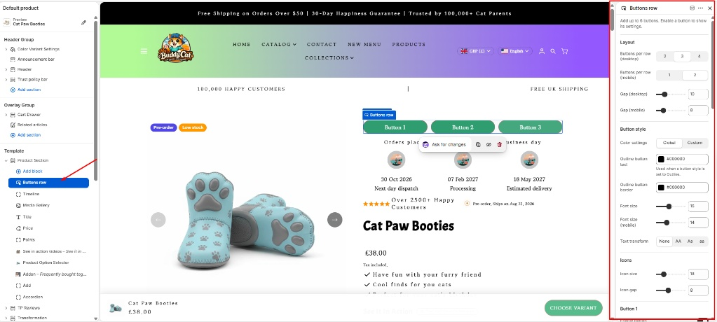 Step 2: Configure Layout and Styling Settings
Click on the Buttons row block in the sidebar to open its customization panel.
Layout Controls:
Choose how many buttons to display per row for both Desktop (2, 3, or 4) and Mobile (1 or 2).
Adjust the Gap (Desktop) and Gap (Mobile) sliders to control spacing between your buttons.
Button Style:
Select your Color settings (Global or Custom).
Define custom styling options such as outline text colors, border colors, font sizes, font sizes for mobile, and text transforms (
None,AA,aA,aa).Configure global icon sizes and gaps if you are utilizing icons.
Step 3: Set Up Individual Buttons and Metafields Connectivity
Scroll down the block settings to configure individual buttons (Button 1 through Button 6).
Toggle on Enable button for any button you wish to display (note that up to 6 buttons are supported).
Connecting Content via Metafields:
Next to the Label and Link input fields, click the Connect dynamic source icon (the database/stack icon) to link them directly to your product metafields (e.g., dynamic promotional links or custom button text unique to specific products).
Alternatively, type static labels and paste target URLs manually if you want uniform buttons across all products.
Icons & Behavior:
Upload an optional Icon image (which overrides any Google icon set) or specify a Google icon name (e.g.,
shopping_cart).Choose your button Style (Solid or Outline).
Toggle Open in new tab on if you want the destination link to open in a separate browser tab.
Pro Tip
Dynamic Personalization:By connecting the Label and Link fields of your buttons row to product metafields, you can display different promotional call-to-actions, external documentation, or size-guide links dynamically on a product-by-product basis without needing separate templates.
Need Further Assistance?
If you have any questions or run into any issues setting up your product blocks, our team is always happy to help! Please feel free to reach out and submit a support ticket at [email protected].
Was this article helpful?
That’s Great!
Thank you for your feedback
Sorry! We couldn't be helpful
Thank you for your feedback
Feedback sent
We appreciate your effort and will try to fix the article