1. Open your theme editor.
2. Click on “Add Section”
3. Find and add the “Image With Icons” Section from the block library.
Upload the main image and add Icon Blocks for each benefit.
Styling The Section
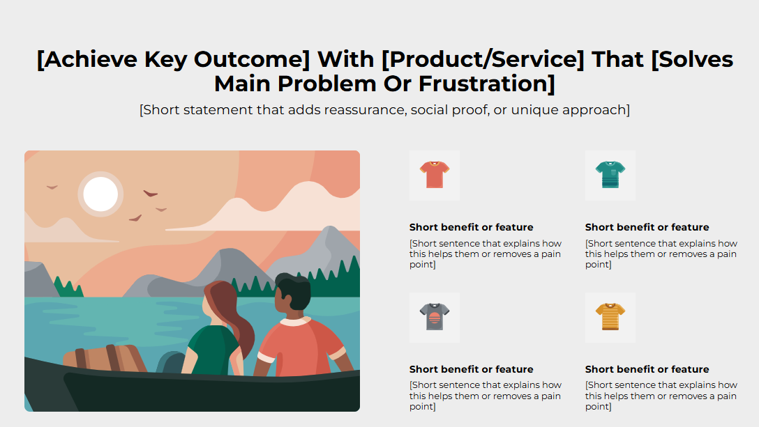
The Image With Icons section lets you showcase your product’s key benefits, features, or unique selling points in a quick, easy-to-scan format.
Use it to help customers instantly understand what makes your product special, whether that’s durability, ingredients, or functionality. Pair meaningful icons with short, benefit-driven text to make information more engaging and trustworthy.
This section works best near the top or mid-page to reinforce value and build buyer confidence at a glance.
Below is a list of all the general settings found on all sections built inside Surge Theme.
Header Content (Title / Subtitle)
A clear title and a supportive subtitle to highlight your product benefits and a clear value proposition.Background color
Set the backdrop of the gallery. Transparent blends with the page background.
Use a subtle solid color if you want images to stand out more.
Heading Size (Small / Medium / Large)
Control the size of your headline choose Small, Medium, or Large depending on how prominent you want your section title to appear,Headline Typography (AA / Aa / aa)
AA = ALL CAPS (bold and strong).
Aa = Title Case (professional).
aa = lowercase (minimal, casual).
Font Family.
Default: Use your global theme fonts to style the section.
Custom: Allows you to select an alternative font to style this section
Example: Montserrat is a clean and legible font for modern looking stores.
Title Color
Titles: Sets the colour of the blocks main headline
Subtitles & Body Text: Sets the colour of the subtitle and card copy
Verified Text: sets the colour of the “Verified Customer” tagline.
Heading Alignment
Choose alignment: Sets the position of the headline and supporting copy Left, Center & Right Aligned. The center option is most common for galleries.Section Width (Full/Contained)
Full Width: Block spans the entire width of the screen.
Contained: Adds side margins for a neat look.
Padding (Desktop: H20 V20 / Mobile: H20 V20)
Controls spacing around the gallery elements both horizontal and verticalExample: Desktop Horizontal = 70px (wide margins).
Mobile Horizontal = 15px (compact for small screens).
Icon Text Color — color for the icon labels (e.g., #000000).
Image Position (Left / Right) — determines whether an image sits left or right on the icon list.
Image Round Corner — e.g., 30 px for rounded image look.
This section allows you to customize the look and feel of your Icon blocks.
Each Icon Block typically includes:
Title for Block
Short headline (e.g., Strength Training). Keep ≤ 3 words.Description
1–3 sentence explanation. Keep concise and benefit-focused.Icon
Upload SVG/PNG; recommended size 24–48 px (or 64 px on retina). Keep consistent style across blocks.
Keep 3–4 icon blocks, enough to show variety but not overwhelm.
Use consistent icon style (outline or filled).
Place the most important benefit at the top-left (eye reads left-to-right, top-to-bottom).
Use an image that reinforces the benefits (product lifestyle shot).
Add alt text to the image and icons for accessibility.
Q: Can I make the icon clickable?
A: Typically these are non-linking informational blocks. If you need links, add CTA buttons nearby or use a different section pattern.
Q: Recommended icon file type?
A: SVG for crispness; PNG as a fallback.
Icons misaligned → Ensure consistent dimensions and padding.
Description wraps strangely → Shorten copy or increase container width.
Mobile stacking awkward → Switch image position on mobile or reduce number of icons.
Images are high quality and not pixelated.
Icons display consistently and are aligned.
Text is legible on mobile and desktop.
Section spacing (padding) looks balanced.
Accessibility: alt text set for image and icons.
Was this article helpful?
That’s Great!
Thank you for your feedback
Sorry! We couldn't be helpful
Thank you for your feedback
Feedback sent
We appreciate your effort and will try to fix the article