Adding The Section To Your Store
1. Open your theme editor
2. Click on “Add Section”
3. Find and add the “Product Block” Section from the block library
Styling The Section
The Product Blocks section serves as the core of your product page, bringing together everything customers need to make a purchase decision.
It includes pricing, variant options, images or videos, reviews, FAQs, and add-ons, all within 15 customizable blocks.
This modular setup lets you design a high-converting, fully functional product page with no coding required, perfectly tailored to your brand and customer journey.
Step 1 - General Settings
Below is a list of all the general settings found on all sections built inside Surge Theme
Background Color
Set the backdrop of the gallery. Transparent blends with the page background.
Use a subtle solid color if you want images to stand out more.
Heading Size (Small / Medium / Large)
Control the size of your headline choose Small, Medium, or Large depending on how prominent you want your section title to appear.Headline Typography (AA / Aa / aa)
AA = ALL CAPS (bold and strong).
Aa = Title Case (professional).
aa = lowercase (minimal, casual).
Font Family
Default: Use your global theme fonts to style the section.
Custom: Allows you to select an alternative font to style this section
Example: Montserrat is a clean and legible font for modern looking stores.
Title Color
Titles: Sets the colour of the blocks main headline
Subtitles & Body Text: Sets the colour of the subtitle and card copy
Verified Text: sets the colour of the “Verified Customer” tagline.
Heading Alignment
Choose alignment: Sets the position of the headline and supporting copy Left, Center & Right Aligned. The center option is most common for galleries.Section Width
Full Width: Block spans the entire width of the screen.
Contained: Adds side margins for a neat look.
Padding (Desktop & Mobile)
Controls spacing around the gallery elements both horizontal and verticalExample: Desktop Horizontal = 70px (wide margins).
Mobile Horizontal = 15px (compact for small screens).
Display On
Choose where to show the section. Default: All Devices.Gap Block
Vertical spacing between child blocks. Increase breathing room, reduce to compress page.Uppertitle
Small trust label above the product title, useful for social proof. (e.g Reviewed by +100 Happy Customers)
Why these matter: These global settings set readability, brand tone, and responsiveness for the whole product area.
Step 2 — Block SettingsThere are around 16 blocks that you can add to your Product Blocks and below is the explanation of each of the blocks and the settings inside them:
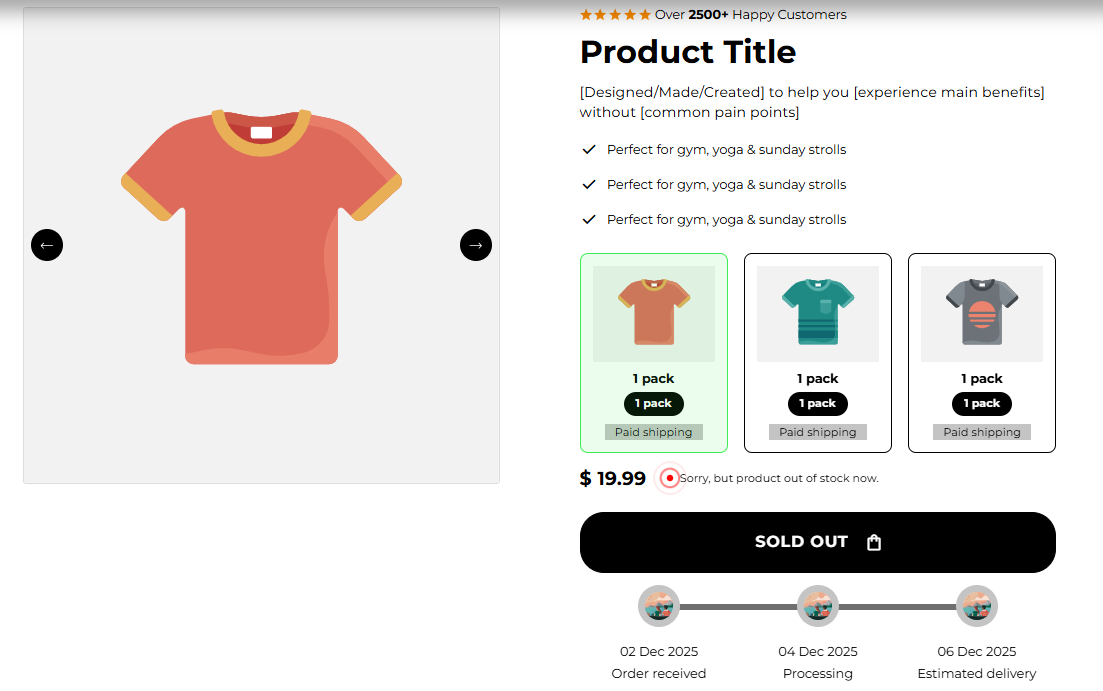
Purpose: This displays your product pricing alongside controls for stock messaging and colors for in-stock/out-of-stock statuses.
In Stock Text (In Stock.)
The message shown when the variant is available. Keep short: “In Stock” or “Available”.Out of Stock Text (Sorry, but Product Out Of Stock now.)
Message when unavailable. Use friendly language and optionally guide to alternatives.In Stock Color / Out Stock Color (Transparent)
Text or badge color for those messages. Use a green for in-stock and red/gray for out-of-stock for clarity.
How to use: Customize the exact phrases and colors to match your tone and urgency (e.g., “Limited stock” in orange).
Purpose: Controls appearance of the main product description.
Text Color (#000000)
Color for description paragraphs. Ensure high contrast with the background.
How to use: Keep the description concise (3–5 short paragraphs), highlight benefits and key specs, and this block sets its visual color.
Purpose: Shows 1–3 short benefit points each with an icon, a quick scan for shoppers.
Fields:
Icon Image for Point 1 / 2 / 3
Upload SVG/PNG icons (24–48px).Icon Symbol / Google Icon
Alternative to upload: You can simply download and use Google fonts instead of manually uploading one.Text For Point 1 / 2 / 3
Short benefit lines (≤7 words). Example: “Perfect for gym, yoga & strolls”.Font Color (#000000)
Color for the point text.
How to use: Use three focused selling points (benefit, result, differentiator). Keep icons uniform style and color.
Purpose: Small badges (e.g., Lab Tested, Money Back) that add product trust signals.
Fields:
Background Item Color
Circle/card background behind each icon.Icon Item Color
Fill color inside icon shape (if using emoji or image overlays).Text Position (Bottom / Right)
Where the text sits relative to the icon.Icon Type
Choose Image, Google Material Icon, or Symbol/Emoji.Icon Image: upload 60×60px PNG/SVG.
Google Material Icon Name, e.g., science.
Symbol/Emoji. Paste an emoji like ?.
Text
Label lines (e.g., “Lab Tested / For Safety”).
How to use: Use 3 trust icons (lab-tested, third-party verified, recyclable packaging). Keep background contrast readable.
Purpose: Showcase optional add-on products customers can add with the main product. This helps you increase your average order value (AOV) and revenue per session (RPS) for each customer order.
Fields & usage:
Section Title (Addon)
Section heading for this area.Container Styling & Card settings
Visual card controls (shadow, border, radius). Defaults give a soft card look.Horizontal / Vertical Padding
Spacing around the addon cards.Select Addon Product 1/2/3
Pick products from your catalog.Custom Title 1/2/3 (optional)
Override product title to display a short label (e.g., “Sample Pack”).
How to use: Use Addons for complementary SKUs (e.g., shaker, travel pack). Use clear price display and brief title.
Block 6 — Gifts (Unlock Gifts)
Purpose: Configure free or unlocked gift items when cart or purchase rules are met. This helps in increasing the conversion rate for your store.
Fields & usage:
Section Title (Unlock Gifts)
A heading describing the process and the gifts your customers can unlock.Lock Image
Icon shown while gift is locked (recommended 100×100px).Cards Settings
Visual card control for gifts.Gift Image
Image shown when unlocked (100×100px recommended).Gift Title
Label for the gift.Gift Product
Link the gift to a store product (so clicking goes to gift details).Gift Rule Sum / Quantity / Local vs Global area
Configure rule that unlocks gift:Local = rules apply to current product/cart item only.
Global = apply based on cart totals or site-wide rules.
Price / Quantity = define thresholds (e.g., “unlock when cart ≥ £50” or “buy 3 get gifts”).
How to use: Use Gifts to incentivize larger carts (“Free sample when you spend £40”). Carefully set Local vs Global to match your promotion.
Purpose: Display size chart and size selector helper content. This helps your customers choose the correct size, reduce return rates and increase conversion rate for your store.
Fields:
Background Color
Set the backdrop of the gallery. Transparent blends with the page background.
Use a subtle solid color if you want images to stand out more.
Heading Size (Small / Medium / Large)
Control the size of your headline choose Small, Medium, or Large depending on how prominent you want your section title to appear.Headline Typography (AA / Aa / aa)
AA = ALL CAPS (bold and strong).
Aa = Title Case (professional).
aa = lowercase (minimal, casual).
Title Color
Titles: Sets the colour of the blocks main headline
Subtitles & Body Text: Sets the colour of the subtitle and card copy
Verified Text: sets the colour of the “Verified Customer” tagline.
Icon Image / Symbol
Optional icon for the size card.Size Chart Text
Heading text (e.g., “Size Chart”).Size Chart Image
Upload the size chart graphic (e.g., Size.png).
How to use: Always include a size chart for apparel or variable-size items. Use a clear image and a short note about fit (e.g., runs small to size up).
Purpose: This allows you to mention the 3-step process of the shipping and delivery process. For eg, You place order on X date order is processed by Y and is delivered by Z.
Icons (1/2/3)
Upload or choose Google icons for timeline steps.Text Under Icon 1/2/3
Short captions (e.g., “Step 1 - Product Ordered. Step 2: Product Shipped. Step3: Product Delivered”).Stroke Item Color / Background Item Color / Icon Item Color
Visual colors for the timeline bar and nodes.Enable Delivery Timeline Mode
Toggle to use delivery-centric labels.Days Until Step 2 / Step 3
Set delay between steps (e.g., 2 days, 4 days).Step Labels
Text for each step (Order Received, Processing, Estimated Delivery).
How to use: Use Timeline to show your 3-step process, i.e the status of each step of the delivery process. When the order is placed, is shipped and is delivered to the customer.
Purpose: Display additional product images.
Main Image (Optional)
Upload a hero image; if blank, the product’s featured image is used.
How to use: Use high-quality lifestyle shots and close-ups. Ensure alt text and consistent aspect ratios, galleries, or alternate views.
Purpose: Embed product video (YouTube or uploaded file).
Fields:
Video Type (YouTube Link / Upload Video File)
Choose source URL.YouTube URL
Paste full YouTube link (e.g., https://www.youtube.com/watch?v=VIDEO_ID).Video File
Upload MP4 (if using local file).
How to use: Add short (30–90s) product demo or usage video. These can be pulled directly from your YouTube channel or uploaded directly to Shopify.
Purpose: Highlight an individual customer quote near the product and add social proof.
Fields:
Testimonial Text
Short quote.Customer Photo
Upload reviewer image.Customer Name
Reviewer name (e.g., Michael).Verified Buyer
Label if reviewer is verified.Star Rating (0–5)
Numeric star display.Cards Settings (shadow, border, radius)
Visual styling.
How to use: Place a strong testimonial near the product summary to increase trust. Keep quote under 2 sentences.
Purpose: Grid of icons + short labels to highlight features, certifications, or quick facts.
Fields:
Icons 1–4
Upload icon images or provide Google Icon/Class.Text Under Icon 1–4
Short label (e.g., “Lab Tested”).Mobile Settings
Configure mobile-first title/description for stacked layout.
Stroke/Background/Icon Item Colors
Visual controls for the grid.
How to use: Use for four quick value props (e.g., Free Shipping, 30-Day Returns, Vegan, Banned Substances Tested).
Purpose: Let customers choose pack sizes or multi-pack bundles directly on the product page. This also helps facilitate and display bundle discounts and free shipping with certain choices for your customers.
Fields:
Cards Settings (visuals)
Styling for pack cards.Pack Shipping Background / Text
Visual and label for shipping text.Pack Image (200×200 px)
Pack thumbnail.Pack Title / Pack Quantity text / Pack Quantity
Label and quantity (e.g., “1 Pack”, quantity 1).Discount Label / Discount Label Bg
Add labels for discounts here. e.g., “Best Value” with badge color.Price Label / Price Label Bg
Visual price tag styling.Pack Shipping (Paid shipping)
Shipping label per pack.
How to use: Use pack options to increase AOV (3-pack discount). Use the Discount Label to highlight the higher priced product and mark as “Best Value / Most Popular” to drive higher AOV.
Purpose: Collapsible FAQ area for product-specific Q&A, shipping, returns, ingredients, etc.
Fields:
Accordion Title 1–10
Question headings.Accordion Content 1–10
Answers (rich text).
How to use: Add common customer questions (shipping time, ingredients, refund policy). Keep each answer concise (1–3 short sentences) and structured.
Purpose: Controls how customers choose color, size, and other variants.
Fields:
Color option / Label (Choose a color)
Label for color selector.Color style option (Drop down / Variant buttons)
Choose how colors are displayed (dropdown vs swatches).Size Buttons / Label (Select size)
Toggle for size selector style (buttons vs dropdown).Default Dropdown / Label (Choose an option)
Generic variant selector for other options.
How to use: Use visual swatches for color where possible (improves conversion). Use buttons for a small set of sizes; use dropdowns for many variants. Set defaults carefully (e.g., no default selection for required options is safer to avoid accidental purchases).
Order blocks logically: Price → Variant Selector → CTA → Points → Media Gallery → Description → Reviews → FAQ.
Keep critical actions above the fold (price, variant selector, add-to-cart).
Use consistent iconography across Points, Trust Icons, and Square Icon Grid.
Limit add-ons & gifts to 2–3 to avoid cognitive overload.
Always provide size charts & variant guidance for apparel.
Use clear pack labels and show the per-unit price when offering bundles.
Ensure all interactive elements work on mobile (touch targets at least 44px).
FAQs
Q: Can I show multiple pack options with different shipping?
A: Yes, you can configure Pack Shipping fields per pack card with clear labels.
Q: My video won't play on mobile, why?
A: Ensure the uploaded MP4 is encoded for mobile and the host (YouTube) allows playback on mobile.
Q: Should I use buttons or dropdowns for variants?
A: Use visible buttons/swatches for high-visibility options (color, size). Use dropdowns for many options (less visual noise).
1. How do I set the delivery date for the shipping timeline?
Open the Timeline Block and turn ON Enable Delivery Timeline Mode.
Then set:
Days Until Step 2 (e.g., 2 days after order = “Shipped”)
Days Until Step 3 (e.g., 5 days after order = “Delivered”)
This automatically calculates and displays the estimated delivery date on your product page.
2. My product images or videos aren’t showing up
Open the Media Gallery or Video Block and check:
The image or YouTube link is actually uploaded.
The file format is supported (JPG, PNG, or MP4).You clicked Save in the top-right corner of the Theme Editor.
If still hidden, refresh your page, it often reappears after saving.
3. The star ratings or icons look dull or invisible
Go to General Settings → Star Color or Trust Icons Block → Icon Item Color, and pick a bright, high-contrast color (e.g., gold or orange).
Avoid using the same color as your background, it can make icons disappear visually.
4. My size chart or icons look misaligned on mobile
In the Size Chart Block or Square Icon Grid, reduce the padding or gap between items.
Use the mobile preview in the Theme Editor to fine-tune until alignment looks even.
5. Add-ons or gifts aren’t showing on my product page
Make sure the Addon Block or Gifts Block is placed inside the Product Block section. If it’s still hidden, open Display On → All Devices to confirm it’s not turned off for mobile or desktop view.
6. My product price or stock message isn’t updating
Open the Price Block and ensure the product you’re viewing actually has variants or stock data set in Shopify Admin.
After editing, click Save and refresh your preview. Shopify sometimes needs a reload to sync the updated data.
7. The text colors don’t match my theme
Go to General Section Settings → Title Color and Text Color, then adjust for better contrast.
Example: Use dark gray (#000000) text on a light background, or white text on dark sections for clarity.
✅ Tip: After every change, always click Save and use the Preview button to check your updates on desktop and mobile. Most small issues fix themselves after saving and reloading.
Price, stock messaging, and in-stock/out-of-stock item colors display correctly.
Variant selectors (color/size/default) work & update price/availability.
Addons show correct SKUs and update cart totals.
Gift unlock logic works for Local & Global rules.
Media gallery & video play on desktop & mobile.
Timeline (delivery/result) reads correctly and step days match expectations.
Trust icons, points, and testimonial cards display consistently.
Ensure media is correctly sized so as not to affect page load time.
Was this article helpful?
That’s Great!
Thank you for your feedback
Sorry! We couldn't be helpful
Thank you for your feedback
Feedback sent
We appreciate your effort and will try to fix the article