Overview
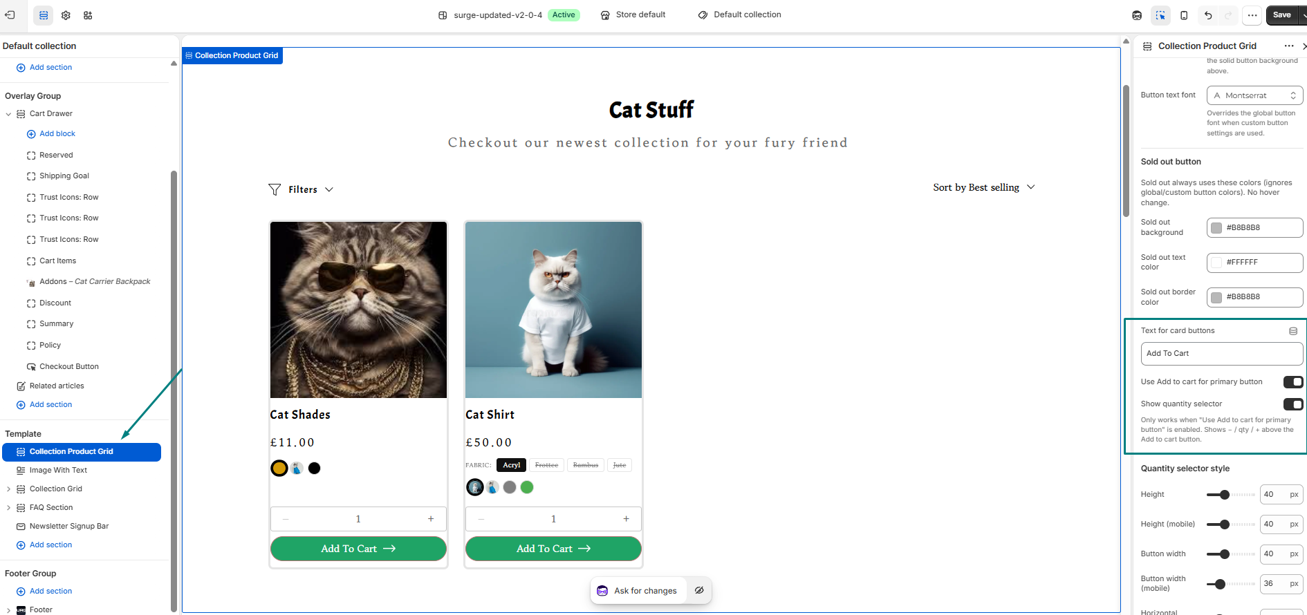
Surge lets shoppers pick a variant and add a product to their cart straight from the collection page, without opening the product page first. This is controlled in the Collection Product Grid section, where you can show variant options on each product card, choose how non-color options display, customize the Add to Cart button text, and add a quantity selector.
On the cards, color options display as swatches, while other options (such as size or fabric) display as pills or a dropdown.
Step-by-Step Guide
Step 1: Open the Collection Product Grid
- In Shopify, go to Online Store → Themes → Edit Theme.
- Open a Collection template (for example, Default collection).
- In the left sidebar, under Template, click Collection Product Grid. Its settings open in the right-hand panel.
Step 2: Show variant options on the product cards
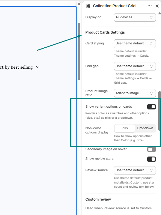
- Scroll to Product Cards Settings.
- Turn on Show variant options on cards. This displays color as swatches and other options (size, fabric, etc.) as pills or a dropdown.
Step 3: Choose how non-color options display
Under Non-color options display, select one:
- Pills: shows each option as a clickable button (e.g., Acryl, Frottee, Bambus, Jute).
- Dropdown: shows the options in a compact dropdown menu.
Options that are out of stock appear crossed out, as in the Fabric example in the preview.
Step 4: Enable Add to Cart on the cards
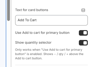
- Scroll down to the Text for card buttons field.
- Type the wording you want on the button (default: Add To Cart).
- Turn on Use Add to cart for primary button so the card shows an Add to Cart button.
Step 5: Add a quantity selector (optional)
Turn on Show quantity selector to display a – / quantity / + control above the Add to Cart button.
This only works when Use Add to cart for primary button is enabled.
Step 6: Style the quantity selector
Under Quantity selector style, adjust the following:
- Height and Height (mobile)
- Button width and Button width (mobile)
- Further alignment settings listed below these
Step 7: Customize the sold out button
Under Sold out button, set the colors shown when a product is unavailable:
| Setting | Default |
|---|---|
| Sold out background | #B8B8B8 |
| Sold out text color | #FFFFFF |
| Sold out border color | #B8B8B8 |
The sold out button always uses these colors. It ignores your global or custom button colors and has no hover change.
You can also set a Button text font (for example, Montserrat), which overrides the global button font when custom button settings are used.
Step 8: Save your changes
Click Save in the top-right corner of the Theme Editor. Use the device preview icon in the toolbar to check how the cards look on mobile.
Pro Tip
If the quantity selector isn't showing on your product cards, check that Use Add to cart for primary button is turned on first. The quantity selector depends on it. If your cards feel crowded, set Non-color options display to Dropdown to save space, especially for products with many sizes or fabrics.
Need Help?
If you get stuck or something doesn't look right, our team is happy to help. Submit a ticket to [email protected] and include a screenshot of your Collection Product Grid settings so we can get you sorted quickly.
Was this article helpful?
That’s Great!
Thank you for your feedback
Sorry! We couldn't be helpful
Thank you for your feedback
Feedback sent
We appreciate your effort and will try to fix the article