Overview
The Header Layout setting in the Surge theme allows you to control how your store navigation appears across desktop and mobile devices. Depending on your preferred structure and user experience, you can choose between three layout options:
Hamburger Navigation
Traditional Navigation
Hybrid Navigation
Each layout affects how your menu, logo, and header icons (account, search, cart) are displayed.
Available Header Layout Options
1) Hamburger Navigation
This layout displays a hamburger icon (☰) in the header. When clicked, it opens your main navigation menu in a slide-out panel.
Best for:
Minimalist header designs
Stores with many menu items
Modern, mobile-first layouts
What it looks like:
Hamburger icon on the left
Centered logo
Account, search, and cart icons on the right
Menu opens in a drawer when clicked

2) Traditional Navigation
This layout displays your navigation links directly across the header.
Best for:
Stores with fewer top-level menu items
Brands that want high menu visibility
Classic ecommerce layouts
What it looks like:
Logo aligned to the left
Menu links displayed horizontally (e.g., Home, Catalog, Contact)
Account, search, and cart icons on the right
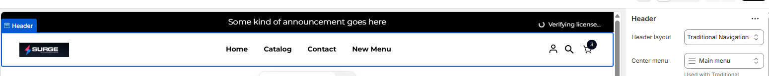
Note: The Center menu setting is used with Traditional or Hybrid Navigation to select which menu appears in the header.
3) Hybrid Navigation
Hybrid Navigation combines both approaches:
A hamburger icon
A visible horizontal menu
Best for:
Stores with key primary links you want visible
Stores that also need a full expanded menu structure
Larger catalogs with layered navigation
This layout gives you maximum flexibility by allowing quick access to core links while still supporting a full navigation drawer.
How to Change the Header Layout
Follow these steps to switch between header layouts:
Step 1: Open the Theme Editor
In your Shopify Admin, go to Online Store
Click Themes
Select Customize on your published Surge theme
Step 2: Open the Header Settings
In the left sidebar, click Header
Step 3: Select a Header Layout
Locate the Header layout dropdown
Choose one of the following:
Hamburger Navigation
Traditional Navigation
Hybrid Navigation
Step 4: Assign the Menu (If Using Traditional or Hybrid)
Locate the Center menu setting
Select the menu you want displayed (e.g., Main menu)
Step 5: Save Your Changes
Click Save in the top-right corner
Your header will update instantly in the preview.
Important Notes
The hamburger menu automatically uses your assigned navigation structure.
Traditional and Hybrid layouts require a menu selected in the Center menu field.
Always test both desktop and mobile views before publishing changes.
If you need help choosing the right layout or setting up your navigation structure, we’re happy to assist.
Please click “Create a support ticket” inside your account or email us directly at [email protected], and our team will be glad to help.
Was this article helpful?
That’s Great!
Thank you for your feedback
Sorry! We couldn't be helpful
Thank you for your feedback
Feedback sent
We appreciate your effort and will try to fix the article