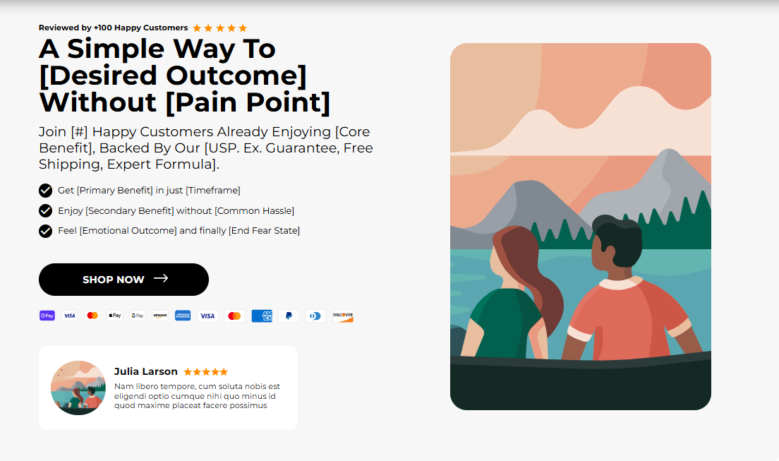
The "Hero Banner - Cropped" is the primary visual headline for your page. It combines a powerful title + subtitle, imagery (desktop & mobile versions), optional points/icons, an optional testimonial, and a clear CTA. Use it to introduce your hero product or campaign and drive a primary action.
1. Open your theme editor.
2. Click on “Add Section”.
3. Find and add the “Hero Banner - Cropped” Section from the block library.
Styling The Section
The “Hero Banner - cropped” serves as the main visual spotlight of your store’s homepage. It combines a compelling headline, subheadline, powerful imagery (with desktop and mobile versions), and a clear CTA, all designed to capture attention instantly.
You can also enhance it with optional icons, highlights, or testimonials to add credibility. Use this section to introduce your hero product, announce a campaign, or convey your brand’s story, while guiding your customers towards a key action right from the start.
Below is a list of all the general settings found on all Sections built inside Surge Theme.
Background Color
Set the backdrop of the gallery. Transparent blends with the page background.
Use a subtle solid color if you want images to stand out more.
Font Family
Default: Use your global theme fonts to style the section.
Custom: Allows you to select an alternative font to style this section
Example: Montserrat is a clean and legible font for modern looking stores.
Title Color / Subtitle Color / Verified Text Color / Body Text Color
Titles: Sets the colour of the blocks main headline
Subtitles & Body Text: Sets the colour of the subtitle and card copy
Verified Text: sets the colour of the “Verified Customer” tagline.
Section Width
Full Width: Block spans the entire width of the screen.
Contained: Adds side margins for a neat look.
Padding (Desktop & Mobile)
Controls spacing around the gallery elements both horizontal and verticalExample: Desktop Horizontal = 70px (wide margins).
Mobile Horizontal = 15px (compact for small screens).
Display On
Choose where to show the section. Default: All Devices.Align Content (Top / Center)
Vertical placement of text block inside the banner.
Why it matters: These set the stage for layout and responsiveness before you add content.
Inside the Hero Banner section, click Add block → Hero Banner (or Banner Block).
Each block is one hero card: text, images, points, review, CTA. You can add multiple banners to the same block, allowing it to function as a carousel.
This section allows you to customize the content of your headline and subtitle.
Title
Main headline that shows in big fonts and showcases your brands USP or value proposition (e.g., The #1 Choice for Everyday Athletes). Keep ≤ 6 words.Subtitle
Short supportive line (e.g., Honest, reliable & lab tested). One sentence max.Uppertitle.
Small pre-heading (e.g., Reviewed by 100+ happy customers). Also acts as social proof.Stars Color
Set star icon color (e.g., #FC4F00) for displaying your customer ratings.
Tip: Put the strongest benefit in the Title; use Subtitle to clarify.
This section allows you to upload an image and set its position for both desktop and mobile.
Image for Desktop
Upload the desktop hero image (recommended width 1600–2000px). Use JPG for photos, PNG for transparency.Image for Mobile
Upload a mobile-optimized crop (recommended width 800–1200px). Always supply a mobile image to avoid awkward crops.Image Position Desktop (Left / Right)
Where the image sits relative to text. Place the image on the right if you want the eye to finish on the CTA (text → CTA position).Image Position Mobile (Top / Bottom)
Stacking order on small screens; Top shows image first.
Why separate images: Different aspect ratios avoid cutting faces or CTA areas on mobile.
This setting controls the overall layout width, padding, and spacing of the section.
Container Background Image (Desktop/Mobile)
Optional textured/backdrop behind content.Horizontal & Vertical Container Padding
Controls spacing around the gallery elements both horizontal and vertical.Example: Desktop Horizontal = 70px (wide margins).
Mobile Horizontal = 15px (compact for small screens).
Container Corner Radius
Rounded corners for the banner frame (e.g., 10px).Heading Typography
AA = ALL CAPS (bold and strong).
Aa = Title Case (professional).
aa = lowercase (minimal, casual).
Header Text Color / Points Text Color
Ensure high contrast (WCAG AA).Heading Alignment (Left / Center / Right).
Choose alignment: Sets the position of the headline and supporting copy Left, Center & Right Aligned. The center option is most common for galleries.
Practical default: Heading Size Medium, Aa typography, left align for product pages.
This section allows you to customize the settings including icons, images and text you use for the numbered bullet points.
Show Points (On/Off)
Toggle 1–3 short benefits beneath the heading.Icon Image for Point 1–3
Upload small SVG/PNG (24–48px).Text for each Point
Short benefit phrases (≤ 7 words), e.g., Most Researched Gym Supplement.
Use case: Quick scannable reasons to buy, keep to 3 or fewer.
Step 7 — Review Settings
This setting allows you to customize how you want to display your reviews and its image, title and text.
Review Show (On/Off)
Toggle to show a testimonial.Review Image
Small avatar/logo (80–150px).Review Title
Reviewer name (e.g., Julia Larson).Review Text
Short 1–2 line quote.
Why: Authentic short reviews right near the CTA boost conversions.
Step 8 — Button Settings
This section allows you to control how your call-to-action buttons look and behave.
Button Text
Keep short: BUY NOW, Shop Creatine.Button Link
Link to product or collection (use theme link picker).Settings: Global / Custom
Global uses theme default; Custom lets you override.Button Border Size / Color
Set the button border size and color. e.g., 0 for none or 1px #000000.Button Corner Radius
Set the button corner radius e.g., 10px.Button Background / Text Color
Button background and text color can be set here. e.g., BG #FC4F00, Text #FFFFFF.
Accessibility: Ensure button text contrast ≥ 4.5:1. Test with a contrast tool.
Use two images (desktop + mobile).
Title short + benefit-driven.
CTA visible above the fold.
Limit points to 3 max.
Use real testimonial text and reviewer name.
Compress images (aim <300KB desktop when possible).
Add alt text for images.
FAQs
Q: Can I auto-rotate multiple hero blocks?
A: Some themes support rotating heroes; use only if each slide has a distinct purpose.
Q: What if my mobile image is cut off?
A: Upload a dedicated mobile crop and set Image Position Mobile to Top.
Q: Do I need reviews?
A: No, but a short genuine quote helps conversions.
Hero text blending with image: Add a semi-transparent overlay or change text color.
CTA not clickable: Ensure link field is set and not empty; check for overlapping elements in CSS.
Slow load: Compress images or use lazy-loading where possible.
Icons not appearing: Verify file type (SVG/PNG) and re-upload.
The desktop hero image displays correctly.
Mobile hero image displays correctly.
Title, subtitle, and upper title read clearly.
CTA is visible and links properly.
Points/icons render consistently and are readable.
Review/testimonial (if present) shows correctly.
Color contrast and button accessibility validated.
Page loads acceptably on mobile network.
Was this article helpful?
That’s Great!
Thank you for your feedback
Sorry! We couldn't be helpful
Thank you for your feedback
Feedback sent
We appreciate your effort and will try to fix the article